Fall is in full force here in Cincinnati, Ohio, and 2019 is creeping up on the horizon. The past year has brought some innovative design trends to the forefront, and we’re reviewing some of our favorites while assessing why these trends are so impactful to consumers.
First up on the docket: Responsive logos.
Given the many ways mobile has revolutionized how consumers access brands, responsive logos have become a must. Implementing differentiations of your logo ensures you’re not compromising the identity of your brand, and it’s a strategic way to reinforce your brand across different mediums. Think of the different ways you see Nike use their name interchangeably with the iconic Nike swoosh. The reality is, where you put your logo has a lot to do with where you’re putting it, so you want to have options for how you can put your best food ahead of you. Maintaining that sense of relevance to your audience should be of high priority, so be sure to condense your logo in an intentional way.
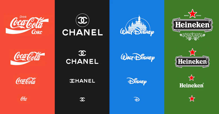
Photo by Joe Harrison; Select examples from "Responsive Logos"
Remember when gradients indicated the “cool” themes on PowerPoint in the mid-2000s? Gradients, or “color transitions”, bowed out for awhile, but now they’re back and just as popular as they were before. Brands like Instagram have already adopted the once sidelined tactic, and it’s trending. We’re seeing more and more principles from the flat design space evolving, and gradients are now being utilized as a way to enhance UI design in an engaging way. We’re seeing this principle finds its space in the modern world of design—meshing colors of the same palette to create a smooth, rich appearance that aligns with today’s aesthetiacs.
The gradient comeback comes with an emerging focus on shadows and depth. Initially used as a tool for establishing visual hierarchy, depth became a way for designers to guide the eye of the viewer in an intuitive yet subtle way. Now, designers are using shadows to create depth in UI design executions. This addition often brings simplicity to the overall feel of the design, and translates as an asset for optimizing usability.
On the note of colors, we’re seeing everything from the notoriously coined “millennial pink” to vibrant, electric hues that bring you back to the rock bands of the 80s and 90s. As designers engage more and more with flat design, color plays a critical role in maintaining appeal and engagement. In addition to color variations we’re arguably more used to seeing, abstract palettes, geometric designs, and detailed patterns are becoming increasingly normalized. In addition to adding a dose of pizazz to your designs, it also commonly adds a touch of nostalgia.
Flat design isn’t the only aspect of the umbrella in the midst of a field day. Movement is redefining the way consumers engage with digital content thanks to new innovations like gifs. A design principle that’s largely brought on by UX, these micro-interactions are a ground-breaking way to modify your engagement strategy. In fact, the introduction of this practice has been so paramount that it translates as one of the most popular UX trends to date. These details make ordinary actions and standard CTAs feel more profound, and give users a sense of ownership and accountability for simply utilizing an interface in the way it was designed. We’ll likely see more of this in 2019.
Bold typography, authentic lifestyle photography, and highly-curated vintage styling are other trends we’re seeing claim their power in the design space. How do you think these trends will evolve moving forward? Which ones will flourish and which will flop? Tell us what you think in the comments below.